Creating an Approachable Data Product with R
Using Shiny and rCharts
William Surles
Product Data Scientist @ Rally Software
Intro
A D3 chart
Quiz
How many lines of code did I write to make this chart?
- 1
- 10
- 100
- 1000
I used R not javascript/html/css
n1 <- nPlot(y ~ x, group = , data = , type =)
About Me
- Mech Engr -> Building Energy Researcher -> Data Scientist
- Product Data Scientist at Rally Software
- Love exploring tools and techniques
Who is Rally?

How I work with teams
- I focus on product usage
- Data engineers and programmes
- Product owners and Developer teams
- Sales and Enablement teams
Goal for Presentation
- I want to share everything I have learned with you
- 1 year of making shiny work in business
- I have figured out many small things that make it powerful
- Take it, Learn it, Change it, Improve it
Outline
- Tool Overview
- Business value
- Demo
- Steps to make a shiny app
- Code chunks
Tool Overview
What is Shiny?
Shiny

Simple Shiny App
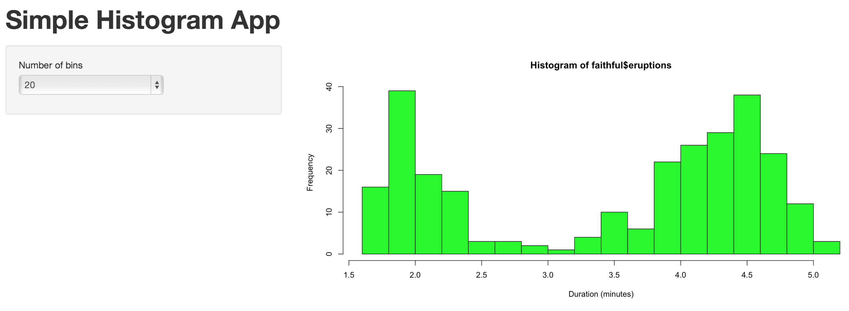
ui.R
shinyUI(pageWithSidebar(
  headerPanel("Simple Histogram App"),
  sidebarPanel(
    selectInput(inputId = "n_bins",
                label = "Number of bins",
                choices = c(10, 20, 25, 30, 50),
                selected = 20
                )
  ),
  mainPanel(
    plotOutput(outputId = "main_plot")
  )
))
server.r
shinyServer(function(input,output){

  output$main_plot <- renderPlot({
    hist(faithful$eruptions,
         breaks = as.numeric(input$n_bins),
         col = "green",
         xlab = "Duration (minutes)")
  })
})
Advanced Shiny App
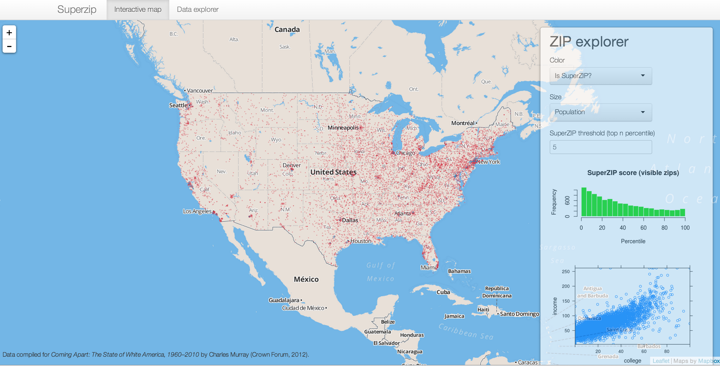
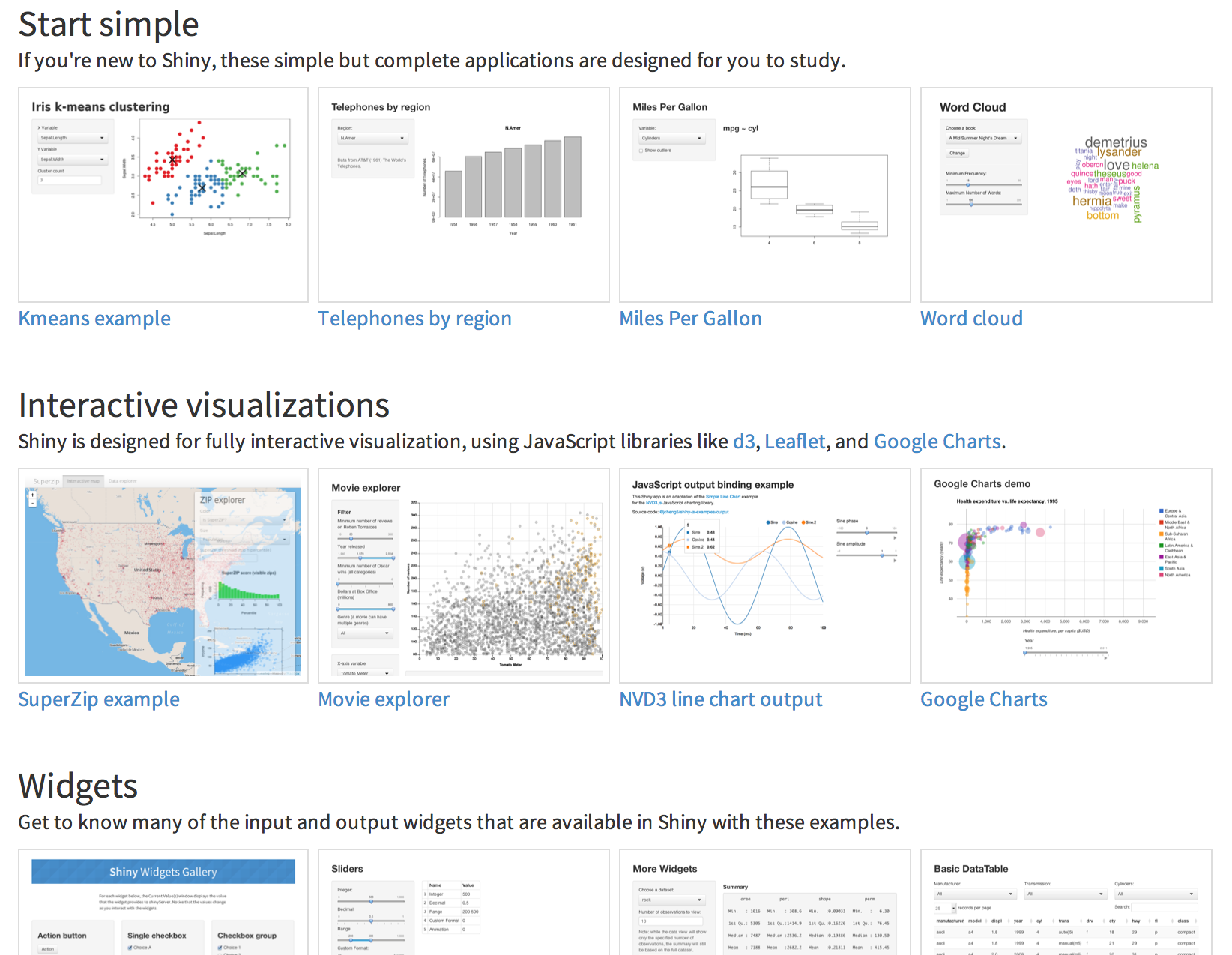
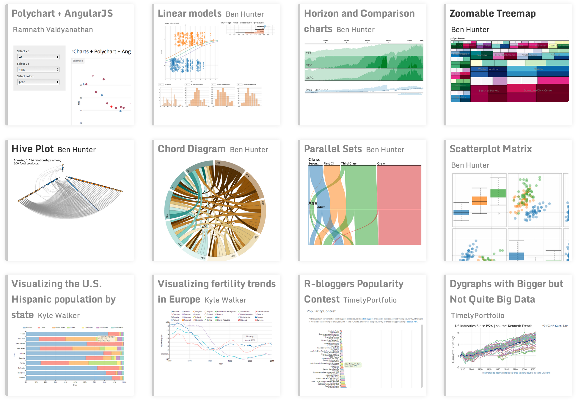
Check out more examples
http://shiny.rstudio.com/gallery/
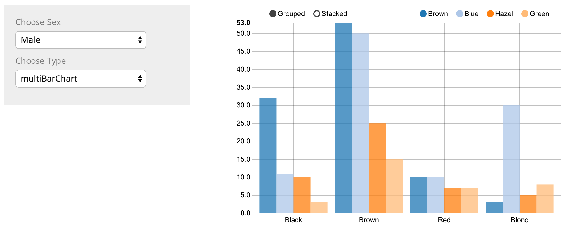
What is rCharts?
rChart
rChart code
require(rCharts)
require(knitr)
haireye = as.data.frame(HairEyeColor)
n1 <- nPlot(Freq ~ Hair,
  group = 'Eye',
  data = subset(haireye, Sex == 'Male'),
  type = 'multiBarChart'
)
n1
Shiny and rChart
More rChart examples
Business Value
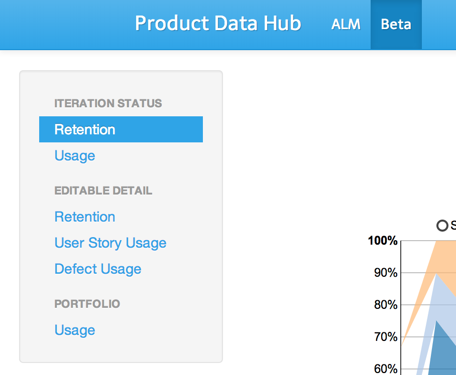
Product Data Hub
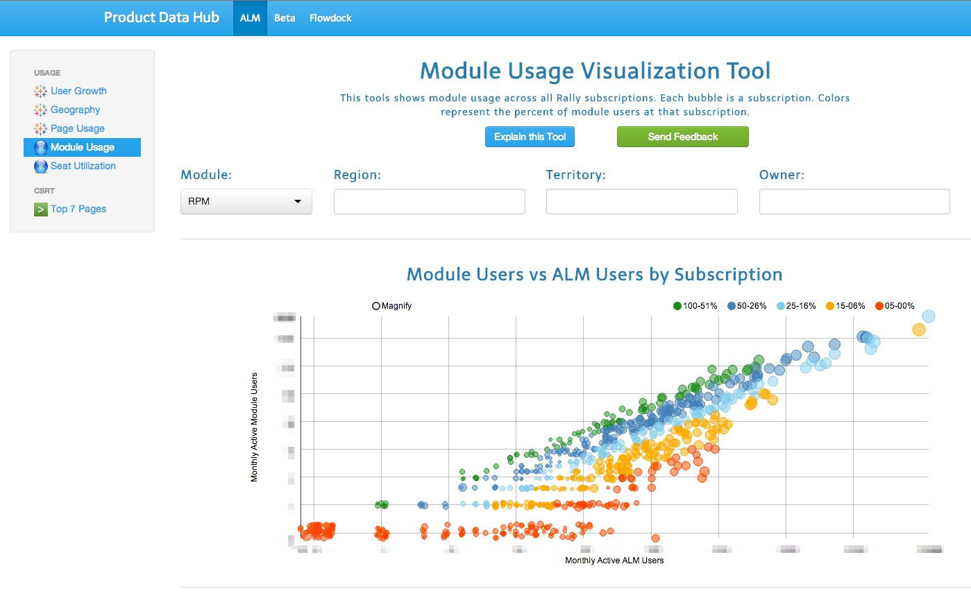
Product Data Hub
- Built with R using Shiny and rCharts
- Interactive analysis and charts
- Embed other dashboard here also
- Serves many teams in Product and Sales
Top 3 Reasons for Shiny
- Interactive - Individuals can easily slice and dice data
- Removes interrupts - Don't have to re-run and re-share analysis.
- Cheap - Free to build and share
More Reasons for Shiny
- Customizable - Pick your colors and style and layout
- Simple - One place to see everything that matters
- Extensible - Web functionality (navigation, modals, styles)
Top 3 Reasons for rCharts
- Tooltips - Answers the next questions
- Beautiful - Looks great and D3 is amazing
- Density - Change the view right there
More Reasons for rCharts
- Simple - Don't need to write 3 languages
- html, css, javascript
- Unique - There are charts that no other library can make
- Presentation - Sharing is such a key part of the data flow
Demo
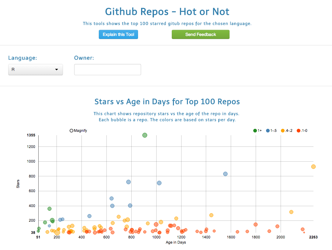
Github Hot or Not Shiny App
http://surlyanalytics.shinyapps.io/github_hot_or_not/
App repo
- https://github.com/wsurles/github_hot_or_not
- Learn how to code this app
- Help me make it better
- Thanks!
Shiny workshop
- https://github.com/wsurles/shiny_workshop/tree/advanced
- Build 3 apps self paced
- Progressively more powerful
- The steps are smooth. It has been tested.
Steps to make a shiny app
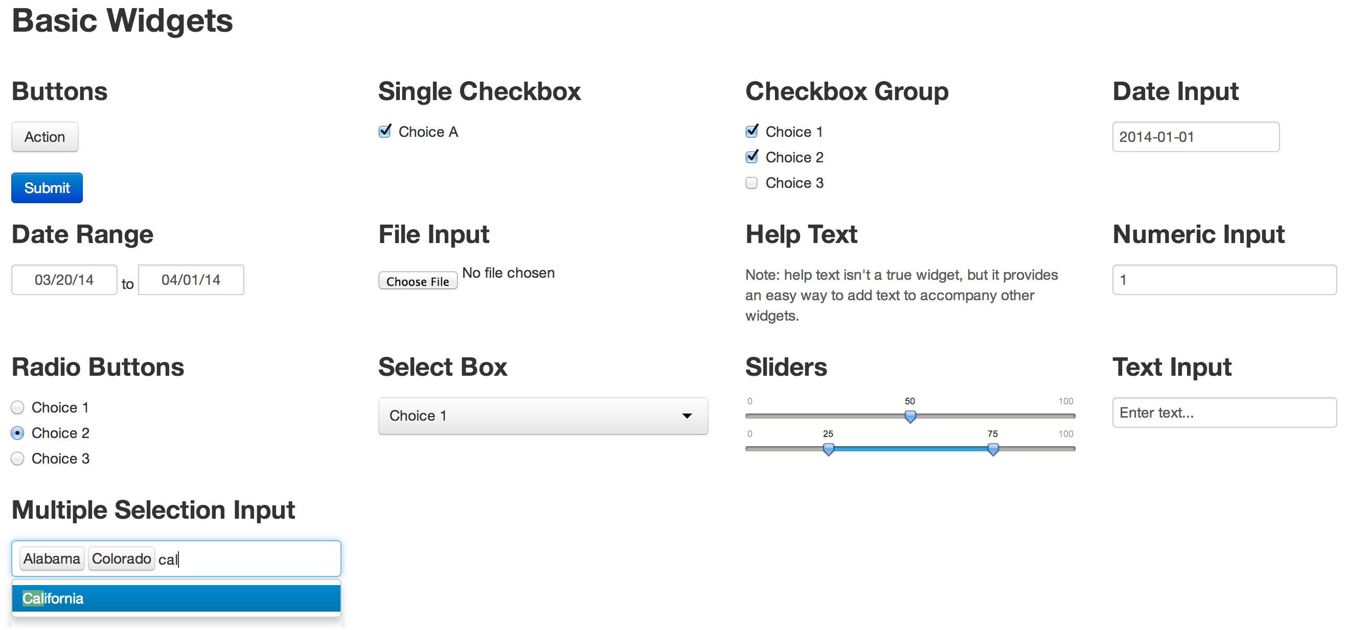
Add inputs
http://shiny.rstudio.com/gallery/widgets-gallery.html
Build charts and tables
http://shiny.rstudio.com/reference/shiny/latest/

Add navigation
http://shiny.rstudio.com/reference/shiny/latest/
Chose a theme
Embed other pages
tabPanel("tableau", includeHTML("tableau_dashboard.html"), align = 'center')
Code Chunks
R structure
Use functions
output$plot_github <- renderChart2({

  df <- chooseLang()
  df2 <- crunchDataGithub(df)
  df3 <- filterGithub()
  color <- setColorGithub(df2,df3)
  n <- createPlotGithub(df3, color)

})
Dynamic UI elements
Build ui elements in server.R
output$repo_owner <- renderUI({

  df <- chooseLang()
  df2 <- crunchDataGithub(df)
  owner_list <- sort(unique(df2$repository_owner))

  selectizeInput(inputId = "owner",
                 label = h4("Owner:"),
                 choices = owner_list,
                 multiple = TRUE)
})
Scatter Chart
createPlotGithub <- function(df2, color) {

  df3 <- select(df2, repository_watchers, age_days, watch_group, log_forks,
                     repository_name, watch_per_day, repository_owner,
                     repository_forks, date_created_str)

  p <- nPlot(repository_watchers ~ age_days,
              group = 'watch_group',
              data = df3,
              type = 'scatterChart')
  p$yAxis(axisLabel = 'Stars')
  p$xAxis(axisLabel = 'Age in Days')
  p$chart(color = color)
  p$chart(size = '#! function(d){return d.log_forks} !#')

  return(p)

}
Tooltip
p$chart(tooltipContent = "#!
          function(key, x, y, d){
            return '<h3>' + d.point.repository_name + '</h3>' +
            '<p> <b>' +  d.point.watch_per_day + ' Stars/Day' + '</b> </p>' +
            '<p> Owner = ' +  d.point.repository_owner + '</p>' +
            '<p> Age in Days = ' +  d.point.age_days + '</p>' +
            '<p> Stars = ' +  d.point.repository_watchers + '</p>' +
            '<p> Forks = ' +  d.point.repository_forks + '</p>' +
            '<p> Date Created = ' +  d.point.date_created_str + '</p>'
          }
          !#")
Add javascript
createButtonLink <- function(link, text) {
  sprintf('
      <a class="mcnButton"
      href="%s"
      target="_blank"
      style="font-weight: normal;
             background-color: #337EC6;
             ...
             color: #FFFFFF;
             word-wrap: break-word !important;
             font-family:Arial;"
             >%s</button>
             ',link, text)
}
Add css and style
shinyUI(

  navbarPage(

    id = "nbp",
    title = "Data Hub",
    theme = "bootstrap.css",
    ...
Resources and References
Shiny http://shiny.rstudio.com/
Shiny tutorial https://github.com/wsurles/shiny_workshop
rCharts http://rcharts.io/
Slidify http://slidify.github.io/
Slidify example http://slidify.github.io/dcmeetup/#1